pop-up docs branding
A comprehensive style guide and visual identity for Pop-Up Docs, a new company, including logo design, stationery, mockups, and branding elements to establish a cohesive and compelling brand presence.
2023
The jobCreate a comprehensive style guide and visual identity for Pop-Up Docs, a new company, including logo design, stationery, mockups, and branding elements to establish a cohesive and compelling brand presence.
Pop Up Docs™ is a mobile documentary film workshop and video editing studio (on wheels) that provides skills-building workshops for aspiring documentary storytellers from traditionally underrepresented populations. This entrepreneurial project offers an opportunity to further democratize visual storytelling by centering the power and representation of diverse creators.
Vision Statement: "Pop Up Docs™ envisions a world where young people of color are empowered to tell their authentic stories so that media is truly representative of the communities it is meant to serve.
Client Requests:
- Bright colors
- Reference to modern video technology (no old-school film camera symbols)
- Adaptable from business card to billboard
- Appeals to children and adults
- Suggests/references progression
ResearchAfter learning what Pop Up Docs' mission and vision were, I did research into what companies like this already exist. I explored branding for other non-profit community-building organizations and tech companies. I then had to decide how to combine these two ideas. My client was adamant about a design that was sleek, modern, and simple, while still conveying a sense of film media and progression.
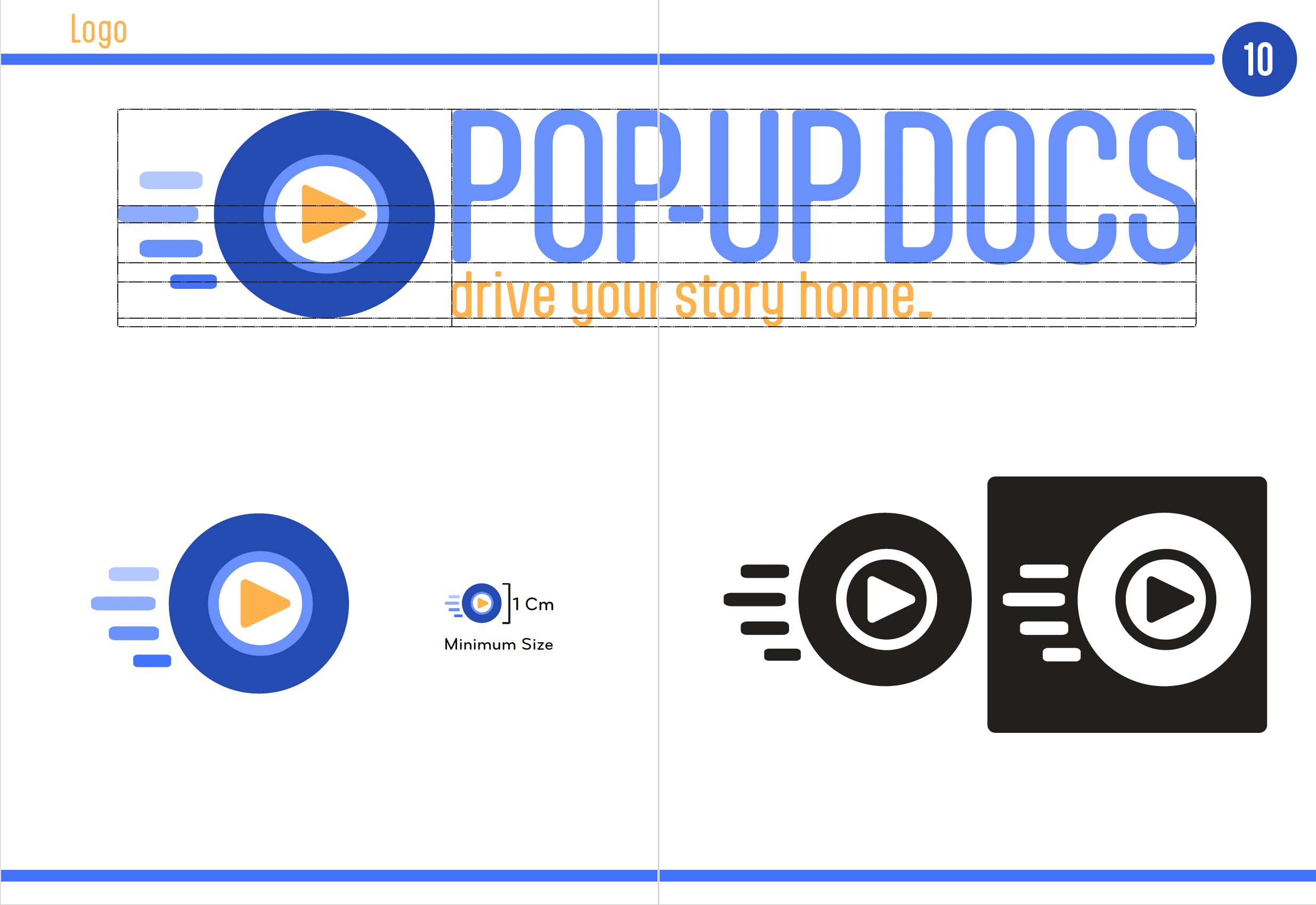
the final logo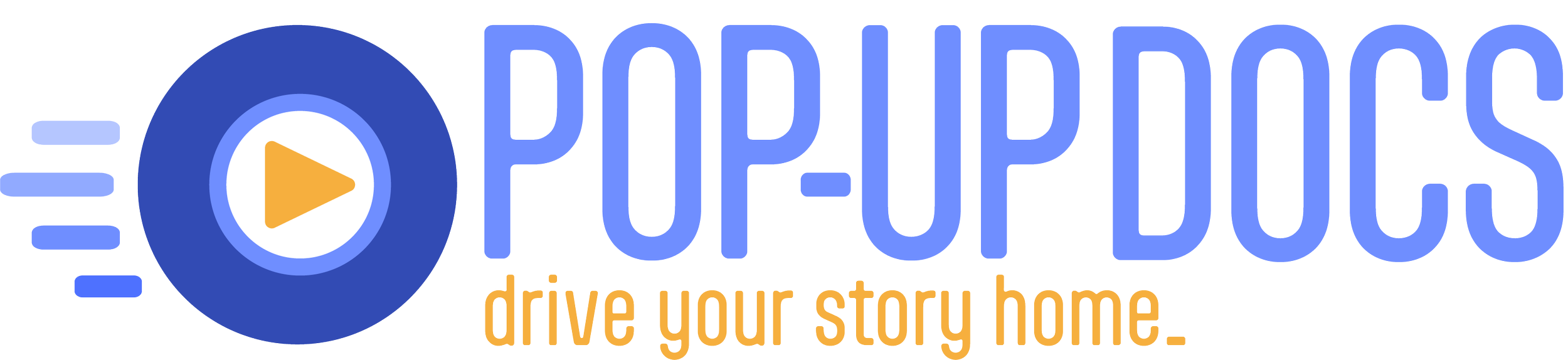
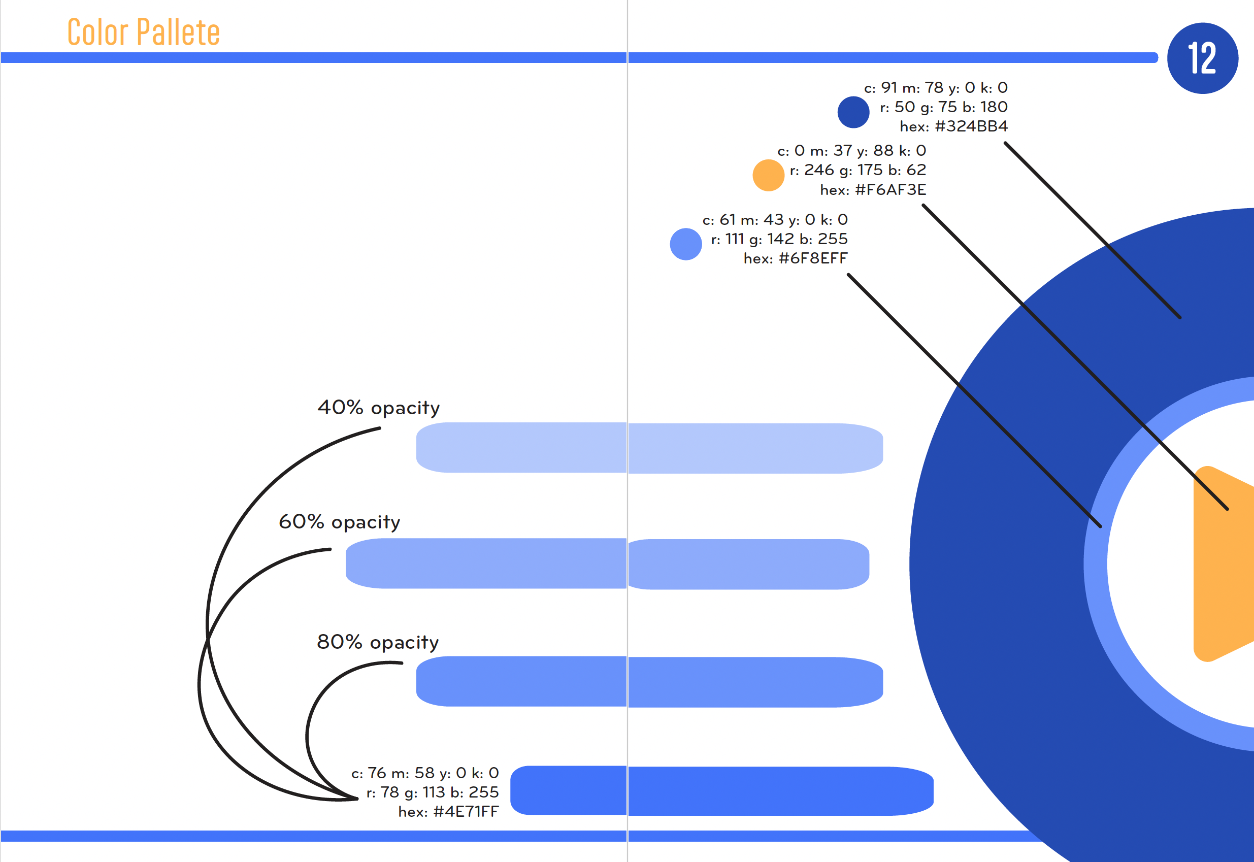
The final logo features vibrant, eye-catching complementary colors designed to stand out on buses and posters. A spinning wheel element introduces dynamic movement, symbolizing progress and emphasizing the company's mobile nature. The play button subtly nods to video media, while the sleek lines and modern font ensure adaptability across various platforms.
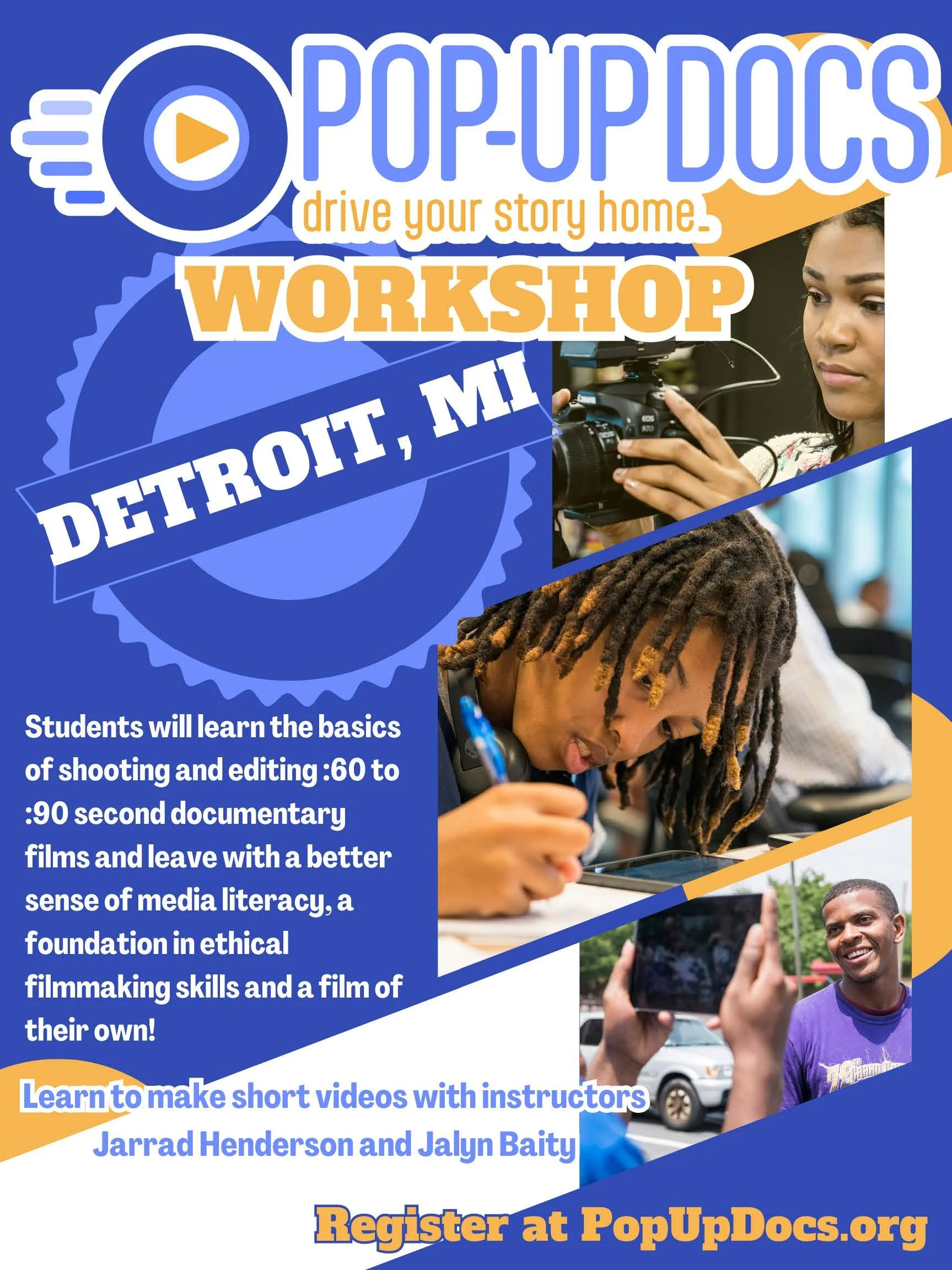
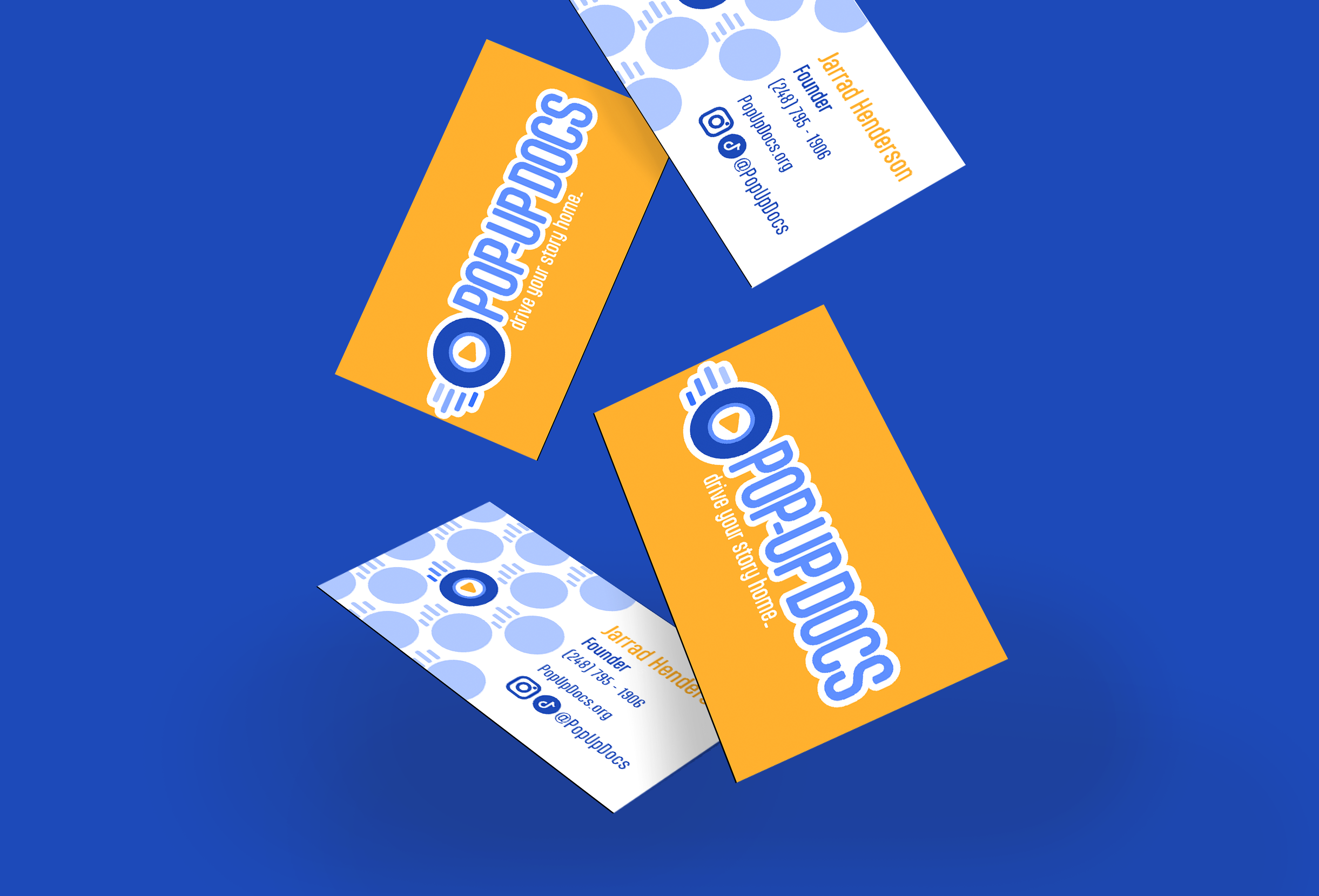
applications

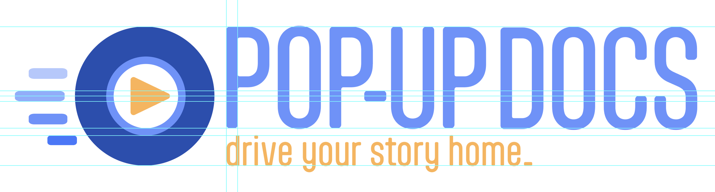
the style guideideation
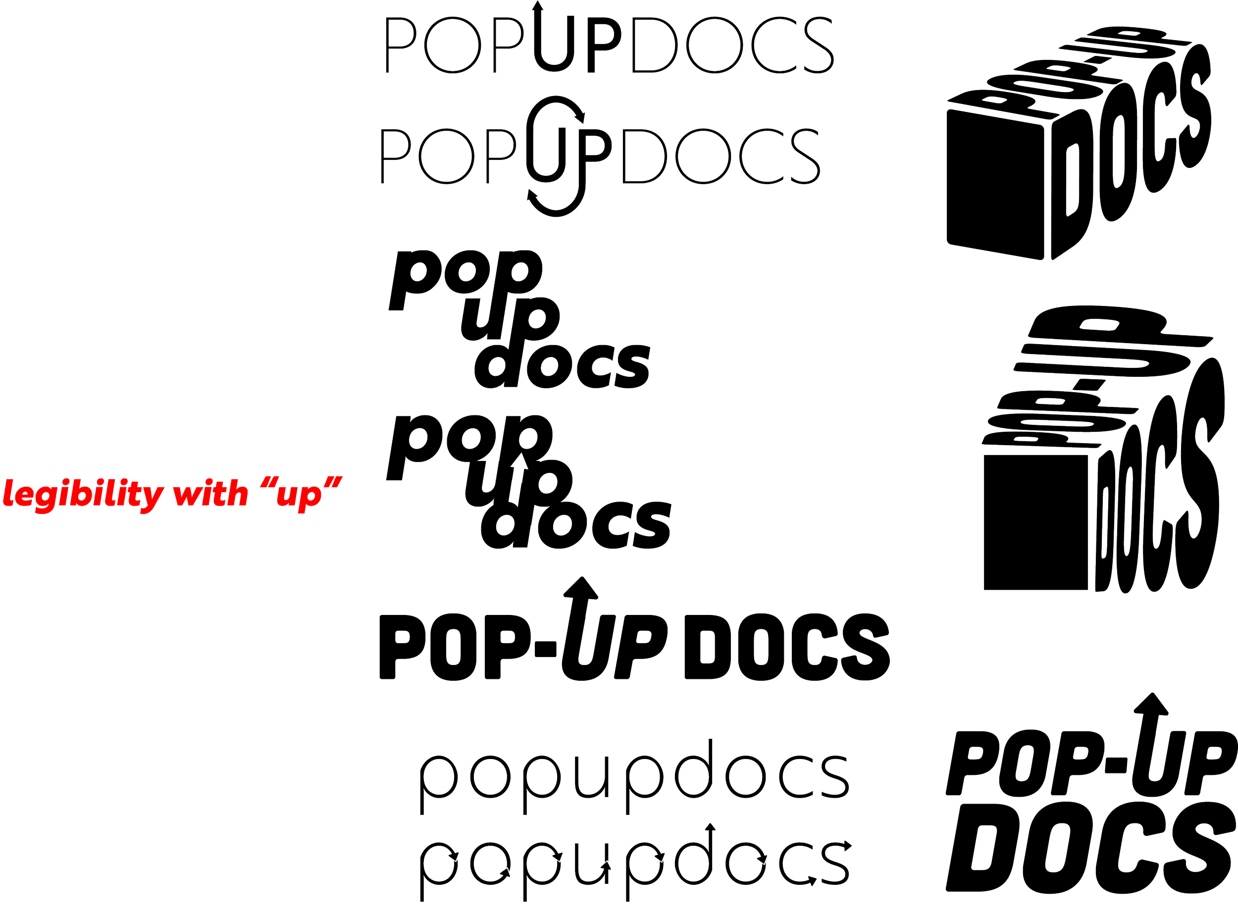
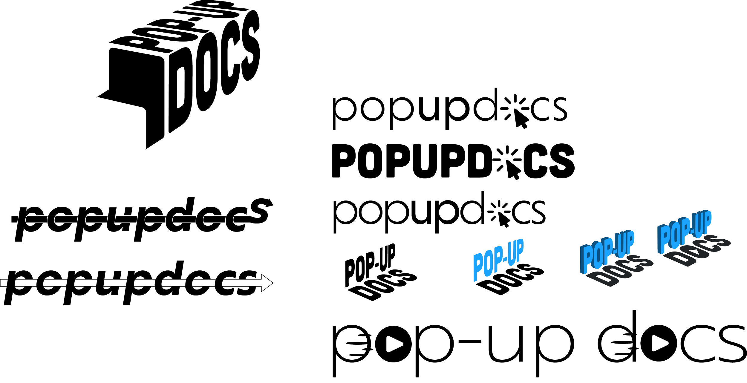
In my first client meeting, I presented a collection of simple, lo-fi sketches. We discussed what ideas he would like to pursue further, and any additional concerns and requests. With this new information, I created higher-fidelity sketches in order to bring the vision to life and narrow down which directions we should fully explore.

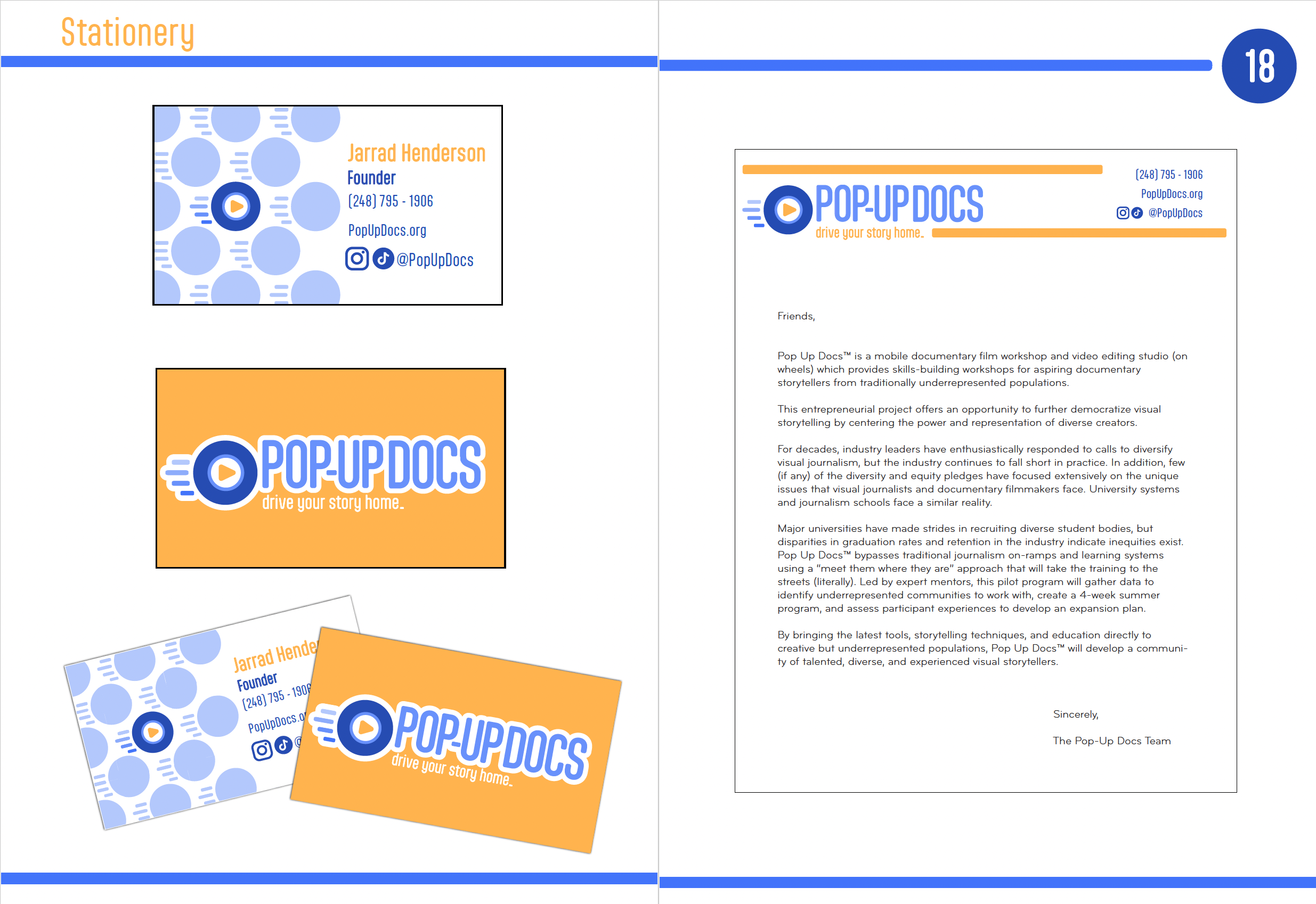
I added color and created some mock-up business cards to help my client visualize the designs.

After narrowing it down to two ideas, I dove deep into perfecting these options before deciding on the final logo.